Uncategorized
0 Comments

Favorite Website

One of my favorite websites is chanceraps.com. It’s Chance the Rapper’s (and his band The Social Experiment’s) site. It literally has everything you need to know about them, what they’re doing, articles, music, upcoming performances and merchandise. Most of it can be found on the home page! They just released a free album, and the first thing you see when you go to the site is the album cover and a link to download or continue to the home page. I love how sleek the website is and I can find whatever I need just by scrolling down. In relation to the ten principles: it doesn’t make users think (literally, everything you need is on the first page); it doesn’t squander patience (you can download music with the click of a button without making an account or signing into anything); they do a good job of focusing attention with a lot of visuals; with the simplicity of it, there’s not a lot of feature exposure; the little writing that’s on the home page is effectively done; as I’ve mentioned plenty of times, the site is very simple; with everything on one page, there’s not a lot of white space and that can definitely be improved upon; the site is mainly made up of visible language and it works great; though it’s not your typical site, it’s conventional enough that most wouldn’t have a problem navigating (it would, however, be easier if the put the navigation at the top rather than the bottom of the page for those that want to get straight to the content they’re looking for). In conclusion, I think it’s a great site with its visual appeal and simplicity. The main thing they should correct is their navigation placement.

 

Uncategorized
0 Comments

Reddit.com

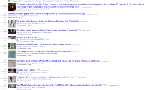
Reddit.com is a pandora box of useful or entertaining information. This website is so simple! All I have to do is scroll down the site and click on a title that grabs my attention. That’s just about all there is to the website. Reddit has a simple easy to use format, but what you are linked to could add some new information in your brain, or simply make you laugh.

reddit

According to The 10 Principles of Effective Web Design this page fits most of the criteria and fails some of it. It’s simple do use so it really doesn’t require a genius to figure out how to effectively navigate the site. You have the option of signing up for Reddit, so you don’t forcefully have to sign up for a service to view the content of the site. Aside from searching for good link titles as I scroll through the pages, there isn’t a lot of attention getting features on the site. Also there is no crazy intuitive design that blows me away. The titles on the links catch my attention! So Reddit does strive for simplicity and has really effective writing. As of now ism guessing the site is only in English. They haven’t really tested anything new because it has had the same format for years. That simplicity is what attracted users in the first place.


Uncategorized
0 Comments

My Favorite Website- CentralTrack.com

My favorite website is Centraltrack.com because I like that they are focused on the music and art scene in Dallas. They always know what’s going on around town and it’s just a cool site to find something to do. I love the design of the website because it is simple and not overcrowded. The site has large visuals and simple fonts that catch your eye and make it easy to communicate their message. The images are also distinctive and the white space isn’t unattractive. I also like the distinctive colors in the navigation bar and I think it’s also worth mentioning that the ads, are small and not unattractive. I hate ads but I’m surprisingly not annoyed by the ads on CentralTrack.

I really love the sideways scroll but I think other users may have trouble figuring that out because we’re so used to scrolling up and down rather than sideways. My laptop is touchscreen so I like it and I think tablet and maybe mobile users would appreciate that as well but I remember being a little confused when I first pulled up the website on my PC a while back. However, I still like it because it’s different and I like the big pictures that link back to different posts.


Dalia Moreno

Uncategorized
0 Comments

Gawker, my site of choice

I selected Gawker Media as my favorite website. I frequently visit their site, almost every day. Gawker is what you would call a new media site. Everything Gawker does is in the usual blog format, but they present all their articles as news. They’ve drawn a lot of criticism in the past, and also get compared to BuzzFeed often. Personally I think they’re a lot funnier than BuzzFeed, and much more credible as well. They don’t really do the clickbait stuff BuzzFeed does, or the annoying “LOL” and “WTF” tags.

Personally what I like most about Gawker is their sarcasm and satirical worth. Unlike the Onion, everything on Gawker is legitimate news and not just made up stories, but they still make it very funny. You could say they put a fun spin on current events.

Now does Gawker properly follow the 10 principles of effective web design? I’d say yes, mostly anyway. They definitely manage to focus users’ attention by having catchy headlines and clever photos. You see an article, and really want to see what it’s about. Their content is laid out in a simplistic manner, with article preview after article preview. Their visible language makes sense. The website is laid out in a straight up linear fashion. Gawker isn’t afraid of white space, that’s for sure, as there is plenty of it in between posts. Obviously as a new media site, they have to focus a significant amount of energy on clever writing. I’d say my favorite part about Gawker is the writing. It’s funny, yet it’s satirical and accurate. If I wanted to read reposts and boring lists of “how to be emo,” I’d visit BuzzFeed instead.

I do see several areas for improvement however. First and foremost, I think Gawker might not do enough early testing. When I had my old phone, and I would try to click on specific links, sometimes those links would literally dance around on the screen, impossible for me to click properly on a mobile device. I also found myself on other affiliated sites like Gizmodo or Lifehacker, and thought to myself, are these sites copying Gawker. No they weren’t, they’re affiliated, more niche specific sites. I think Gawker could have made that more clear when I first became a visitor. In other words, I spent too much time thinking about these auxiliary sites. I also think they’ve done a bad job at not squander users’ patience. I found myself in a pickle trying to sign up after they redesigned their website. It was just too annoying and difficult to sign up until they fixed the issues. Lastly, while they strive to make their new features known, like selecting areas on photos, I don’t see anyone using those features. Those features seem to have taken a backseat to what they could’ve been.

Uncategorized
0 Comments

Favorite Website

One of my favorite websites to visit is craftgawker.com. While I might not have all the time I’d like to make things, this site gives me plenty of ideas for gifts, DIY or any creativity spark I may need for anything else. It’s filled with endless pages of things waiting to be created. It’s an easy website to access and I use it without ever signing up for an account.

Navigation of the page is super simple. It breaks it down by how you want to view things. You have the option to search by category or keyword, view the most favorited or viewed projects or even randomly see what they have to offer. Users aren’t required of much to use this site, which makes it quick and easy.

The site is organized into four columns by photos of each project and as you scroll down, more are added. It’s literally a bottomless fantasy for anyone creative. The site isn’t overly done in design either; it’s a simple navigation bar and columns of photos displayed underneath. The most the user has to do is scroll down and choose a photo to link to the site for that project. Each photo is organized in a clear manner with one or two lines describing the project.

It’s a pretty basic site that’s easy to navigate without having to sign up or subscribe to anything.

Uncategorized
0 Comments

My Favorite Website

After browsing for a couple of minutes over the web I came to find that I really enjoyed the way the Kohl’s layout was setup. Not only did Kohl’s have a clean, and consistent layout throughout the site but I wasn’t consistently  being bombarded with pop up ads coming up on the page or distracted by third party displays on the left or right.  While Kohl’s did have ads for some of its brands such as Jockey I liked that they were both at the top and near the bottom of the page which made it easier to actually focus on what type of item I was looking for and filter out whatever I didn’t want according to the toolbar on the left. Overall, I thought the site was well constructed and followed all 1o principles of what an effective website should look like. The only improvement I could see that Kohl’s should make would be to not have so much going on at the top of the page.


Take a look for yourself and click on the name below to access their page:

Kohl’s


Uncategorized
0 Comments

Website of choice

The website I chose is not necessarily my favorite, nor do I frequent it. I just think it is simple to use and follows the “10 Principles of Effective Web Design” . The website is for Citizen Potawatomi Nation. CPN is my Native American tribe. Originally, I had problems with this website when I used to visit it. It was hard to navigate and there were not many pictures and it wasn’t up-to-date. Now, they have an effective and informative website that is simple yet not too plain.

The home page greets you with a pleasingly designed banner and our logo at the top with the navigation for the site directly underneath. The navigation has drop down boxes when you hover over each section link, which I think is very effective. When you go to the website to find a scholarship or information on the government you don’t need to search around because it is right there on the home page.

Along with many specific links for navigation, this site is chock full of colorful pictures that catch your eye and influence you to want to know more about that story. It isn’t overwhelming with a ton of information about the tribe and services at first. They mostly use pictures and short blurbs on a scrolling widget that has the top stories for the site. The other portions of the site are just as easy to navigate and pleasing to the eye as the home page. Go take a gander and learn about my heritage.

Uncategorized
0 Comments

Well-designed Website.

As a passionate Eagles fan, I enjoy well-written articles about my football team. I also like to read or hear different people’s opinions on the team’s success (or failure) that I can comment on. Bleeding Green Nation is the perfect website for Eagles fans from all over to whenever they want to share the passion with one another. This website is does not ruin users’ patience, it’s simple, and easy to navigate. Each blog post on the home page is accompanied with a picture, text, and an appropriate caption so that users will know exactly what the article is about before they even open it.

The only improvement this website could make is to use more white spice. At times, the homepage is seemingly overloaded with blog headlines and links to other articles. This can give an overwhelming feeling to the visitor and create a disconnect from the website.

Uncategorized
0 Comments

Airbnb

One website I’ve only been browsing recently but am still very impressed with is airbnb.com.

Airbnb serves as a tool to connect homeowners who wish to rent out their houses to customers who would otherwise be staying in oftentimes more expensive hotels. The service has revolutionized the tourism industry.

I’m studying abroad next semester, and often browse the site with my parents, who are looking for apartments to rent in the neighborhood of London I’ll be staying in when they come to visit me.

My favorite thing about Airbnb is how user-friendly it is. As discussed in 10 Principals of Effective Web Design, I really don’t need to think to use the site. The navigation is simple and intuitive. I’ve never had to search for a link on Airbnb; everything I could ever want from the site seems to be at my fingertips. Even my parents, who aren’t as tech-savvy as I am, are able to navigate the site without my help.

I’m also a huge fan of the aesthetics of the site. Airbnb utilizes large pictures and simple text to elicit an emotional response from visitors. Seeing the artsy photographs of cities across the world makes me excited to travel and more likely to use Airbnb, which I’m sure is intentional.

It was hard to decide on anything I didn’t like about the site, but I did find some broken links in their Austin travel guide. I like they way they utilize writing and other content like photography to promote their service, so it was disappointing to find that some of their content wasn’t as seamless as the rest of their site.

Uncategorized
0 Comments

My Favorite Website

I’m not an avid web site goer, I tend to stick to apps on the phone. Recently though, I have been on the job hunt for advertising agencies in Houston and fell in Love with one agency just based on their website. The company is Love Advertising, and their website is all of the Principles Of Effective Web Design wrapped up.

Thought the design is artistic they make it very clear what the website it for. There are not forms you have to fill out, but there is the option to send them a message through their website contact page. My attention stayed focused while visiting the site. My job hunt came to a halt just so I could take a minute to admire their work and how beautifully it was displayed. The website is easy to navigate and there aren’t too many words to take up all your time reading. The design is pretty simple, and modern and has a good amount of white space dividing up the sections. The three principals of “visible language” are followed (although, I’m not sure on communicate about the sizes). This website is far from boring and seems to be very professional with no signs of bugs or glitches. Doing this assignment just makes me want to work there even more.

http://loveadv.com/