Uncategorized
0 Comments

Favorite Website – The Onion

One of my favorite websites is the onion.com . I probably spend way too much time reading articles that I find on their website. It is nice to take a break from reading the typical new stories and it is a breath of fresh air to see current issues made fun of. Overall I really like the websites design, more specifically its simplicity. I often can get easily overwhelmed and distracted when online and get frustrated at the clutter I see on websites such as Facebook and Yahoo. I really enjoy how simple and basic the layout of the onion can be. The site isn’t flashy and is very easy to navigate through. My only real problem with the site is the amount of content available through the search tab. Im not always able to find articles about certain topics that interest me. The majority of the content posted is based on what their writers care to post about. I feel that the onion does a great job of doing the 10 Principles of Effective Web Design. the navigation is easy, the content is clear and attention grabbing.

Uncategorized
0 Comments

Favorite Website

My favorite website would have to be ESPN.com. I have been using ESPN for a very long time now, and I have watched the progression of their website over the last several years. There are some things that some internet users might have issues with, but for the most part ESPN’s website should pass the test for the average sports fan.

The first thing that ESPN does well is that they manage to focus users’ attention. They do a good job of personalizing the pages and focusing on what the user should pay attention to. They often times will place you’re favorite teams on the front pages so that you can access that information more easily.

Next, ESPN makes use of effective writing. Instead of posting a lot of articles on the front page, they instead separate them into different sized headlines, so the reader can pick and choose what they want to read. Additionally, ESPN usually always provide images with their content, which makes the user more likely to read a given article.

ESPN also does an excellent job of communicating effectively with “visual language.” ESPN does a good job of organizing its content into different sections and categories so that viewers can navigate to what they want. They also communicate using visual language and various images and effects.

However, some users might find ESPN a little bit too overwhelming. One thing that ESPN doesn’t do well is striving for simplicity. Although I do think simplicity is very hard to do when it comes to sports websites, ESPN could try to simplify things so the average user could navigate with ease.

The last thing ESPN could work on would be leaving some white space. White space is actually not a bad thing when it comes to websites, as it makes things much easier for the user. Too often ESPN will fill up their website with as much information as possible, when maybe that might not be the best thing for them to do.

All in all, I think ESPN is a really cool sight. It is definitely geared for the sports fan, so an average user might feel a bit overwhelmed. I think they could use some minor improvements that I mentioned above, but I will still be visiting the sight as my number one sports website.


Uncategorized
0 Comments

Favorite Website

One of my favorite websites is Time. I am constantly reading news articles from various websites, and Time has been one of the few that I regularly visit. The site is easy to navigate, the content is great and it isn’t congested with ads.

The 10 Principles of Effective Web Design says, “As web-sites provide both static and dynamic content, some aspects of the user interface attract attention more than others do. Obviously, images are more eye-catching than the text — just as the sentences marked as bold are more attractive than plain text.” Time does a really great job of having images and links on their homepage that capture the reader’s attention. It is easy to distinguish the text. Certain sentences are bold as they should be.

My favorite thing about Time is that they truly have strived for simplicity. I think it’s amazing that everything that is posted on the site is posted with WordPress. The site is simple and easy to use.


Uncategorized
0 Comments

Favorite Website| Sound Cloud

I’ve recently discovered and opened an account with Sound Cloudsoundcloud. I really enjoy this website because of how much it caters to music lovers and the simplicity it offers. Sound Cloud really makes searching for music easy and accessible. This website is also very user friendly, the top navigation bar can take you anywhere you want to go when searching for the right tunes.

The main navigation can take you to the main trends on sound cloud’s homepage, or you can browse your personal collection of songs and playlists you have liked over time and artists you are following. Another great feature about sound cloud is if you are a musician or just love making music, you can upload your own music to sound cloud so others can listen and share whatever you produce.

As I’ve mentioned, the overall design is very user compatible. The design of everything thing on this website was made in favor for users. It contains a limited number of advertisements so that can help user focus on what they came to look for. In addition to being user friendly, this site ultimately puts the user in control of what they see and search. A “who to follow” widget is placed on the right to so the user similar artists or groups they have liked (clicking the heart<3).

One aspect that I really like about the search bar, is that you can search anything involved with music because when results came up you can select and filter out information you don’t want. For instance, you can search for something and then select whether you want view all results, or search specifically for tracks, playlists, people, or groups. This feature allows the user to have instant gratification.

Overall I will continue to use this site for listening to music and discovering artists. Music is the content I am coming back for. Another plus is that it is designed and displayed in a perfect way to make searches easy and stress free.

Uncategorized
0 Comments

A Beautiful Mess

My favorite website, that isn’t a form of social media, is a blog called A Beautiful Mess. ABM was started in 2010 by two sisters, Emma and Elsie, who are the main contributors. They post tidbits about life, recipes, DIY projects, interior design projects and crafts.

I love that their content isn’t your normal basic girl content, but has a little more depth, and that I can scroll through ABM endlessly. One of the things they’ve posted, that I’ve gone back to time and time again is a recipe for a homemade chai latte.

I really like the layout of the site. Everything looks very clean, while still maintaining a cute, fun, girly feel. The whole site is very easy to navigate and well categorized. Overall, they have done a great job designing and maintaining their blog.

Uncategorized
0 Comments

Favorite Website- That Working Girl

My favorite website is That Working Girl. It’s a website built by a woman who writes about working in a daily basis and what’s it like. I do believe the site follows a lot of the standards for an “effective web design”. The reason I like her site is the way it’s customized and how it leaves plenty of white space (rule #7) in each page of her site. It leaves the message clear and simple (rule #6) to the reader and causes no confusion. Although the site is simple, it may be too simple. More content should be put up.

Uncategorized
0 Comments

Favorite Website

My favorite/most visited website would have to be Lululemon. I really like their website because it has a simple look and that is something people look for these days. If it’s too complicated, people are going to exit out of your site. Lululemon is a website for workout clothes and working out is becoming something I’ve been trying to do more often.:)

One thing I like about this website is the logo. It’s so simple and not over powering of the page or brand. They also don’t have their name “lululemon” on their page because they expect their customers to just know their brand and logo and this goes for their stores as well.

As far as the look of the page, the first thing I notice is pictures. They use pictures to describe the separation of men and women items, pants and shorts, tops, accessories, etc. They have minimal wording and that is something I love because pictures can really tell the story of this brand being a work out clothing company without saying much.

Uncategorized
0 Comments

Autumn’s Favorite Website

My favorite website that I use often is Wired. I really like this website because of how it is laid out and consistent throughout each page. Although there are a lot of news websites out there I think this one is different due to how easy it is to navigate.

This website utilizes the “strive for feature exposure” principle very effectively. Every page has the navigation banner with each news category (business, culture, design, gear, science, security and transportation) across it to help the user flip through pages easily. Also, there are arrows that the visitor can switch through each page that has all the news articles on it.

With everything on this website I am very impressed that they have managed to keep so much whitespace. Every background is the same and the articles are centered on the page with air on each side. The spacing between each article and photo also adds to the whitespace.

This website is very easy to access and doesn’t “squander users’ patience.” To view the website one does not have to log in or subscribe to it which is very much appreciated. In fact, the only places that they are asking for your personal information is at the bottom of the website which takes a while to scroll down to. In fact, I rarely make it down that far because I read articles on the “suggested for you” section.

One of the things that I think the website can do better is making it a bit simpler visually. There is a lot of content on each page that overwhelms the viewer when they first get to there. I think there should be fewer items on the home page to help with this. However, everything is divided into categories and color coded which helps group everything together making it a bit less overwhelming.

Another area that could be improved is focusing the user’s attention. Due to all the articles that are on the website there is obviously a lot to be seen. I think a way to try to help with this is dividing things more so there aren’t so many news briefs on a screen at once. I think they attempted to help viewers with this by varying sizes of each headline and photos on the pages.

Uncategorized
0 Comments

Thirteen Thoughts – Favorite Website

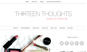
Thirteen Thoughts Homepage

Thirteen Thoughts Homepage

As someone who loves to read blogs, my current favorite website is Thirteen Thoughts. Thirteen thoughts is a beauty and lifestyle blog by a girl off the east coast named Paula. The reason I love this blog is because it has great content while being visually appealing. The blog has a very simplistic style, while keeping the visitor’s attention. The design behind this blog shows that “white space is not the enemy.” Paula does an excellent job in achieving all 10 principles of effective web design. The website is easy to navigate and very user friendly, the content is well written, it is organized and focuses the reader’s attention well. Paula uses a good variety of photos and visuals as well as text, while including links. She included two navigation bars making it easy and simple and she includes extra aspects such as social media widgets. Overall, I think this website achieves what it takes to be an effective site.

Uncategorized
0 Comments

Favorite Website

My favorite, and most used, website would probably be twitter. I find it extremely easy to navigate. The design is simplistic and very user-friendly. You only have a few elements of your home time line which include your text box and others’ tweets to which you’re able to “like” or “retweet” tweets you enjoy.

In terms of “not making the user think”, I believe due to the simplicity of the website, you don’t have to think often unless you’re making changes to your settings. However, in this case the website is still designed so well you don’t do much thinking.

As for grabbing the users’ attention, I do think that twitter takes hold. I follow a ton of news, media, and artists on twitter and in order to keep up with what’s going on in the world as well as my interests, I find myself checking twitter a countless number of times per day. I think though, it depends on the individual’s choice on who they follow, whether twitter will keep their interest. As for my mom, she didn’t last long on twitter.

Looking over the list of the “10 Principles”, I think twitter is effective as a website covers them all. However, links presented by individual accounts that link to other websites cannot affect the way twitter is as its own website.

All in all, I believe twitter itself is designed so well. It’s very simplistic and easy to use. It’s also a way for others to connect to friends as well as news involving their interests.