Uncategorized
0 Comments

Hobby/Interest Website

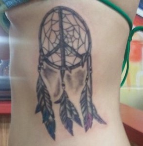
dreamcatcher tattoo peace

My first tattoo, a dreamcatcher on my ribs.

For my website, it was hard thinking of a topic because I do not have any big hobbies and I am not really affiliated with any organizations (besides being a volunteer for Circuit of the Americas and their website is already amazing, so I would not want to compete). However, one thing I have always been interested in is tattoos, so the topic of my website will be tattoos. I chose this as my topic because I have four tattoos myself and I am fascinated by some of the tattoos that my friends and other people have. The last tattoo I got (about two months ago), my mom went with me and she got her first tattoo while I got my fourth one. She had so many questions about placement, how bad it would hurt, aftercare, etc. So this website will be dedicated to people like her who are maybe thinking about getting a tattoo, while also providing some ideas for people who want to get a tattoo, but do not know what to get.

Besides my home page, I will have a page for before getting the tattoo (ideas, placement/where each place on the body will hurt least or most, tattoo meanings/symbolism, how to choose the right shop, etc.), a page for what to expect when getting the tattoo (a detailed list of how most tattoo shops operate), a page for how to care for your tattoo after you get it, and a page for pictures of some of my favorite tattoos (a gallery/table with pictures/slideshow).

I will be choosing my own color scheme since it is not for a specific organization. Two of my favorite tattoo websites that I have visited are the Atomic Tattoo website (located in Austin, TX) and the Tsunami Tattoo website (located in Tacoma, WA). I love the Atomic Tattoo website because it gives you a choice of entering the flash site (which is completely awesome) or the html/mobile website (which still has a great layout). The Tsunami Tattoo website is clean, organized, and nice to look at. Both of websites have darker color schemes (black/brown/red) with white text, which is what I will probably want for my website.

Uncategorized
0 Comments

FMA: Fashion Merchandising Association

I am a member and and officer for the Fashion Merchandising Association that’s why I chose to create a website for them. The organization just underwent a makeover per say and a new website would do a lot for us right now. Besides the home page, I will include an events page with info about the events the organization hosts and volunteers in, including galleries and maybe videos. Also there will be an officers page, organization contact page, a schedule page and  also a blog page.

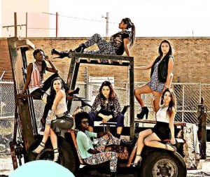
members modeling thrift shop clothes

Members of FMA


The logo for the organization is aqua, black and white. The logo is a circle with the organization’s initials inside the shape. I will be using those same colors for the website possibly.

I want the website to look like Gwyneth Paltrow’s famous Goop . I like this website because it is simple, easy to navigate and super stylish without being lavish and over the top.


Uncategorized
0 Comments

Matthew Gutierrez Movie Reviews


For our next site i plan on writing about movies and reviewing them. I enjoy attending movies but it’s hard on deciding if the movie is worth seeing. Besides my home page I  plan on having a good review page, a bad review page, a page featuring new movie previews, and finally a contact page. I’ll most likely pick my own color scheme. I’d like to have the site resemble Rotten Tomatoes, another movie review site. http://www.rottentomatoes.com/ .  Or a mix of RT and the ESPN site which has a great design http://espn.go.com/ .

rtlogo mlb_escobar_jones_d1_110x62

Uncategorized
0 Comments

Hays-Caldwell County Women’s Center

  • I am going to create a website for the Hays-Caldwell Women’s Center
  • I’m working on a PR campaign for the HCWC and I personally support their cause.
    I want to spread awareness of domestic abuse as much as possible.
  • I will have a home page and include 4 other pages on the website.
    1) A Services page, that lists services.
    2) An About page, with important information about the organization.
    3) Donations page
    4) A Remember page- stories of local domestic abuse victims, survivors of domestic abuse etc.
  • This organization does already have a color scheme of purple and navy blue, and hunter green.
    The purple represents domestic abuse, and will be the main color on the stylesheet.
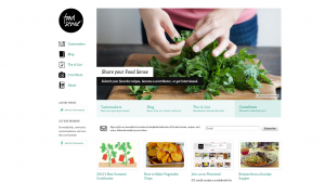
  • I would like my site to look similar to the foodsense.is website
    Screen Shot 2014-10-09 at 4.12.37 PM
Uncategorized
0 Comments

Puppy love

I have a strange obsession with dogs, particularly those poor furbabies without a home stuck in an over-crowded shelter. My site will be dedicated to finding homes for dogs in local shelters(San Antonio to Austin but with a bigger focus on Hays County.) Most shelters have their own website but due to lack of funding they don’t usually have current information.10366126_10152834186753082_8863545125928804866_n

Other than the home page, the site will have a “Pet of the Week” page featuring a new puppy and its adoption info every week, a “Contact your local shelter page”, a “Not ready to adopt?” page with ways to help by volunteering and donations, and I think it would be really cool to have a “Success story” page of recently adopted dogs, but I do not know how realistic it would be to keep up with. I’ve also thought of having a page dedicated to my pup, Jacks, because he was the inspiration for this and I love showing him off.

I do not have a color scheme in mind yet but want something neutral. Pale yellow and gray, maybe? I also couldn’t really find any inspiration from another site. I’ve been on the computer a lot the past few days researching for other things and they’re all starting to look the same.


Uncategorized
0 Comments

Fencing Club website

txstatefencinglogoI’m a member of the Texas State Fencing Club, but we don’t currently have a website, so I’m going to make a website for the club. Besides the homepage, there will be a page for how to join the club, a contact page, a gallery page, and a tournament page for upcoming tournaments and outside tournaments that members might be interested in. I might also add a couple of other pages: a resources page that shows different things like places to buy gear and videos to watch and also a history page for learning more about the club.

The club’s logo is a skull with the three fencing weapons behind it. The logo is white, black, maroon, and gold, so I’ll be using those colors.

I like CBS’s website layout: http://www.cbs.com/. It’s similar to how I want my homepage, with a horizontal navigation and slideshow gallery below that.


Uncategorized
0 Comments

PhotogenNick

For this website, I would like to create an online portfolio of some sorts to market my new obsession with Photography/Media projects. The idea is that I’ll be able to showcase my work, and also discuss various concepts I’ve learned and various tips to help others. This semester I’m taking a photojournalism class and I’ve loved the process of going out and exploring while capturing those moments, but I haven’t really enjoyed the journalistic aspect of that class. This website will serve as a site strictly for photography. Art.

camera

Besides my home page, I will have a page strictly showcasing my work and projects (one), an about me page that will go into further detail about what I want to accomplish and be all about me (two), a contact me page will give viewers access to me for possible bookings/shout-outs if I ever get that big (three) and I would also like to include a page that will almost serve as a blog within the website (four). That page will have tips from me, and discuss ideas that have been discussed to me. There may also be news that I’ll post there that is relatable to the photography world.

Since the site is going to have pictures, I really want to keep the color scheme very neutral. Also, I’m very fond of blacks, whites and greys, so that gives me even more of an incentive to use that scheme. I stumbled upon Tom Hull’s website, and I really like the layout and patterns. However, on my photo’s page, I want to keep the text very minimal. I would like viewers to be able to click on my pictures and be taken to a new page that has more information, or at least have the text pop up if the mouse is on top of the image. I’m not sure… that’s still up in the air. I do want the home page to have one image and my new logo.

I just want the website to speak for itself.


Uncategorized
0 Comments

Hobby Blog

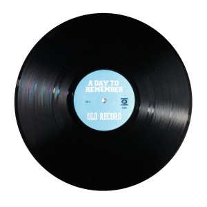
I’m choosing to write my new blog about record collecting and local music shops in the Hays County/Austin/San Antonio areas. Music is something I’m really passionate about, and I just get really hyped about records. I love that it’s an old-school format with such a new, enthusiastic cult following. Besides my homepage, I’m planning to have a music review page, an interview page with store owners or fellow collectors (kind of like a “what’s in my bag” thing), updates on music festivals/shows, and maybe like a community forum where I’d allow people to contribute what artists they like to listen/collect. Debates and such. I don’t have a color scheme yet but it will be of my choosing. Wish me luck!
record

I really like Pitchfork‘s site design. Hopefully I can emulate that into mine.

Uncategorized
0 Comments

Hobby

The topic I will be covering is hunting for this next website. My dad’s hobby is hunting and he came to visit me this weekend and when I told him about this assignment he gave me the idea. Besides the home page, I will have a page on what you can hunt, types of ammo and guns or bows needed/ can get, where in Texas can you hunt, Gun training, and apparell. The color scheme for hunting is camoflauge, so shades of green and brown.


http://www.basspro.com/Hunting/_/T-12425000000

Uncategorized
0 Comments

ACL

Discuss what you like most about the design, as well as what you think could be improved.

From a user experience, is the site easy to navigate?

Does it have quality content? Why do you visit this site? Is it for the design, or for the content?

acl2014Top-0422

I  really enjoy the Austin City Limits Music Festival webpage.

The color scheme and the design are relatively simple and are uniform throughout the website.

The front page is a bit overwhelming as you scroll down. Info Overload.

It is organized, inviting, intriguing, and informative.

I visit the site for both its design and its content.

You come for the content, and stay for the design.

ACL2014-770x5902

www.aclfestival.com