Uncategorized
0 Comments

Twitter

twitter

I love Twitter, and I visit the site countless times throughout the day. I visit the site because of the content that is available. I follow Twitter accounts that tweet information that keep me informed on the things I’m interested in. Through Twitter I can find out breaking news or the latest Hollywood gossip. I can also read motivational quotes and get tips on healthy eating. The home page of Twitter displays the tweets of the accounts you follow and the trending topics. This makes it simple for the user to navigate the site by not having too much content on one page. The only thing I would change on Twitter would be how your followers or the people you are following are displayed. I would give users the option to display their followers by alphabetical order as an easier way to search for a follower.


https://twitter.com/

Uncategorized
0 Comments

Pitchfork.com

Honestly, I probably visit and love Pinterest more than any other website. But, since someone else already wrote about it, I chose my runner up, Pitchfork.com. Pitchfork is THE music blog of music blogs. I discovered it last semester when I was brainstorming ideas for my own blog in FDOM.

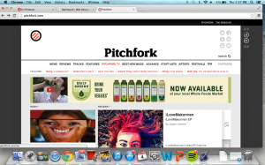
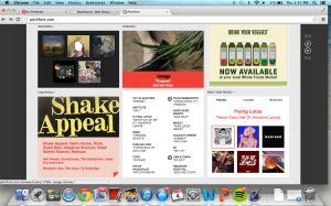
Screen Shot 2014-09-04 at 2.57.15 PM                Screen Shot 2014-09-04 at 2.57.22 PM

I love this site not only for its information (if you ever get bored of your music, it’s the place to go) but also it’s design. It’s easy to navigate, visually appealing, and includes a playlist. You can access each individual song in the middle of the site, or the side bar includes a play, pause, and forward button to stream the entire list. If I could design my own blog in this manner, I would.

Uncategorized
0 Comments

Roosterteeth.com

Rooster Teeth logo

This company was mentioned last class and that someone from Texas State now works for this company (a few more than what he mentioned actually) but I love the stuff Rooster Teeth does and the interface for their website.

Front page RT

The front page of the RT website

I like that when the site loads up it automatically displays the latest videos they have put out. A nice touch that I like is that the site also has widgets in the corner right next to the logo to allow you to follow, like, and sub right from the get-go. I feel like it just says “This is who we are and what we’re about. Like what you see? There’s all the social stuff to keep up to date on what we do”

There are also several other smaller sections of the company that handle different productions and they all have their own separate site, also with their own sets of social profiles, and the links to the different websites are at the very top of the home page for easy navigation. It keeps everything a lot less cluttered and I really like that. There are also links to their store and forums so that you can buy some of their merch and talk with other fans of RT and just immerse yourself in the community.

The whole site is just made to make it as easy as possible to find the content you’re looking for and just get right to it.

Uncategorized
0 Comments

Reddit: The Frontpage of the Internet

reddit-alien (1)

Probably the most eclectic site on the interwebs, Reddit displays a vast selection of  information and entertainment to appeal to anyone’s fancies. I was first introduced to this bundle of fun the summer before my freshman year of college and have since then locked myself in my room, rarely seeing the light of day and wondering to myself, “what the hell did I do for fun before this?”

Reddit is a giant public forum where anyone can post or comment about practically anything happening in the world. You can upvote or downvote any story or comment and be apart of an international community. According to their about page, their stats detail that over 114 million unique viewers visited last month alone with almost 8,000 individual communities, or subreddits. It is usually here on Reddit that I get my daily breaking news first and my cat photos to cut out the middle-man.

Reddit is also one of the very few places where the comments section is just, if not moreso, more interesting to read than the actual posted content itself. The community is upheld to correct grammar and punctuation standards (a big plus for me) and are a articulate and highly creative. You will never see those most irritating of public comment faux paus here.

The one downer about this sight sometimes can be that the material on the front page takes a while to update to something new, and contributing to those headlining posts is impossible. Take for say, an AMA (Ask Me Anything) by your favorite actor pops up, you better be there the second it opens or forget about asking what their most embarrassing moment off-set was. Even just an hour-live post can hold up to thousands of comments.

My favorite subreddit of them all, you ask? Definitely, without a doubt, r/avocadoesgonewild.

Just kidding (maybe), my two favorites are r/redditgetsdrawn and r/myreactionwhen.

Uncategorized
0 Comments

V Magazine

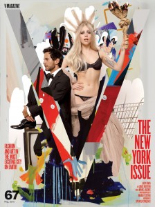
From V-Magazine Archive

From V-Magazine Archive

The array of interests that I truly enjoy are, sincerely, cliche. Many websites aim to provide a balanced combination of these interests, but no one does it better than V Magazine. Although there is something very special about flipping through a printed version of this glossy, their online content is that rare but perfect combination of music, art, fashion and celebrities. Although many websites have similar content, V Magazine creates a chic environment to deliver it.

The main reason that I love this website is their content and the way it’s presented to the user. The modern -almost exclusively millennial- theme of the website is refreshing. It is extremely easy to navigate and it is an amazing source for yet to be discovered musicians and artistes. I’d have to say that V Magazine is my number one source for new music.

One thing that is extremely cool is the archive of past issues. I love that I’m able to go back in time with just one click. The website is also social media friendly, allowing users to share, like, tweet, etc content as they please, this is definitely one of my favorite and most used features.

One thing that I would change or modify is the Tumblr-ish look of the Home page, although it is easy to scroll down and find content a more sophisticated / editorial look would vamp up the website, I think. Aside from that V Magazine Online is heaven for pop culture lovers like myself.

Uncategorized
0 Comments

YouTube

images

How has no one talked about this yet? I cannot be the only one who ends up sitting and watching twenty different videos in a row after looking for “just one” small distraction.

YouTube is fabulous. Not only can you find all the music videos of the artists you already love but you can also end up discovering new talent that will make you seem totally hip once you share it with your friends. Or you can just shake it with Taylor on repeat. Your choice. I think my favorite part about the site is that it allows the public to upload their own videos. . Whether you think you’re a singer, a comedian, or the next Bam Margera you only need to share your video to find out what the world thinks. And they will tell you what they think. Hours, no, days of entertainment can be found on this site.

I think the best design aspect of the site is the bar along the right side of the screen that shows videos similar to the one you’re currently viewing.  From a visitor’s standpoint there is no easier way to lose track of time. Plus it’s such a simple tactic to get the viewer to stay on the site.

Remember last week when we talked about what the most embarrassing thing we have on the web is? YouTube claims mine. The last five years have taught me nothing in regards to my dance skills. Whatever, I’ll just keep shake, shake, shaking it off.

-Birdie Abigail


Uncategorized
0 Comments

Pinterest: The Website of all Websites

Pinterest graphic found on Google

One of my favorite websites to visit is Pinterest. I can spend hours on Pinterest, mostly because of the content, but the design keeps me coming back as well. I like the design because it is simple. It is literally just pictures and captions directing you to other websites. For example, I would go to a website like Amazon and see a dress I really like. On Chrome, I can hover my mouse over the picture of that dress and pin it to one of my Pinterest boards (for example, Fashion). Then it will be out there for anyone who is following me to re-pin as their heart desires. I really like how Pinterest is made personal with boards. I can go to my own profile and see what I have pinned onto my boards.

pinboards

My Pinterest boards


One of my favorite features of Pinterest is the “Everything” page because I can see what people around the world are pinning to their boards. This is where I find a lot of pins that I like and re-pin, and I also will follow people with similar interests as me.

pinning

The “Everything” page on Pinterest

Pinterest is very easy to navigate. For example, if I see a chicken enchiladas recipe on Pinterest, I can re-pin that recipe to one of my own boards (for example, Yummy Foods). Then when I click on the picture, it will take me to the website where that picture was found and give me the recipe for the chicken enchiladas. That is why I call it the website of all websites; it links you to websites all over for the things that interest you.

If I could improve one thing about Pinterest, it would be to somehow organize it so it isn’t so overwhelming. For me, I feel like even though I have found many things on Pinterest that appeal to/interest me, there are probably so many more things I haven’t seen that I would also love. It is a bit overwhelming because there is just so much content. On the contrary, I also love that there is so much content to filter through, which is how I can literally spend hours on the website. Also, it would be cool if you could customize the design more, such as being able to change the background, text color, etc. It is one of the best and most simple websites for both content and design.

Pinterest picture found on Google


Uncategorized
0 Comments

polerstuff.com

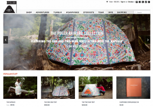
Screen Shot 2014-08-29 at 6.28.45 PMpoler2

I really like Poler's website. It has a nice, clean, easy to use design. Their use of white space helps the user scan the page easily for what they're looking for. One improvement that I would make is to have a link to their bags on the front page instead of the drop down menu. 
Another improvement I would make is to add more photos of the inside of the bags/products and a closer zoomed in photo of the material used. I would add video reviews of the bags and use size comparisons to products. 
The website is user friendly and easily navigable. The content information is exactly what the consumer needs and wants to know. I use this site to buy backpacks and would like to purchase camping gear in the future. I like the website because it is easy to use and their travel videos are cool. 

[youtube http://www.youtube.com/watch?v=0o_QT8i4sK8&w=560&h=315]
Uncategorized
0 Comments

Buzzfeed


buzzfeed

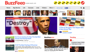
When I’m bored at work or simply have too much time on my hands, I find myself frequenting Buzzfeed. Buzzfeed, if you’re unaware what the site has to offer, is a site that centers on news and content that is buzzing on the web. The content ranges from actual important stories to trivial celebrity news and quizzes, and they have everything in between.

Buzzfeed homepage

What I like most about the website is that there are graphics. Each story has a picture associated with it and the title stands out against the white background. There is an infinite scroll so it’s really easy to stay on the site and take in all of the news. The top toolbar has links to pages with specific information. For example, you can easily access articles that contain important news or you access quizzes. They also have the eight quick links to articles with specific tags such as “trashy,” “LOL” and “trending.

My only issue with the site is that the endless stream of content can be too much at times. You can easily get lost within the endless equally sized stories. As you scroll, the constant rows of pictures and titles can blend together and be rough on your eyes. However, this consistency in displaying their content makes the site easy to use. Everything is where it should be and you easily get the hang of it.

All in all, if you like buzz-worthy content you’ll be able to handle the design. That’s why I keep coming back. Content is king.

Uncategorized
0 Comments

Imgur: the simple image sharer

Imgur logo

The Imgur logo

One of my favorite sites is Imgur. It may be best known as the popular image host for Reddit posts, but it has it’s own community as well, known as Imgurians. Like other Imgurians, I prefer browsing funny photos on Imgur over Reddit because of the differences in their design and layout.

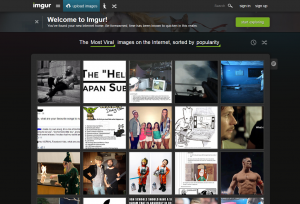
Imgur has a very simple and visually appealing design. The images are displayed as square thumbnails on the front page. You click the image you want to view, and then can view the next image by clicking a “next” button on that page, or go back to the front page to browse. The login and comment boxes are easy to find. The site overall is just very easy to move through.

One improvement that this site could use though would be a way to organize favorite images. Currently, when users favorite an image they just go into one single favorite image folder. It can make finding an older favorite image a time consuming process, as you have to scroll all the way back and sift through the favorites.

Imgur front page

The front page of Imgur

The front page is the golden part of Imgur. The images closest to the front have the highest points and come from either Reddit or the user submitted section. The content is usually pretty funny but can also be moving or informative. The top comments on posts are usually just as good as the picture. I like visiting this site when I want to kill time or just relax. I visit this site mostly because of its content, but the design plays a big role too. The content is somewhat identical to what I can find on Reddit, but I prefer Imgur between the two because of its layout.